BRANDING
Branding is more than creating a logo. My experience has included developing visual identities, maintaining established brands, creating branded materials, and building a brand from the ground, up. These projects explore the different ways I approach identity, consistency, and the practical realities of putting a brand into the world.
Dark Horse Customs
The business was originally Dark Horse Customs, a custom automotive, off-road and restoration shop, which used black and orange for its standard branding colors, and replaced orange for pink on the ladies' apparel line. The brand had already been established before I joined the team as the in-house designer in 2015, but it was my job to maintain it. I had a background in printing apparel and other promotional items, so I already had a firm understanding of what that meant. My prior experience with various printing processes, proper file preparation, imprint placement, creating designs on compositions, creating visual mock-ups, color management, wholesale brand selection, vinyl decal production and installation, and inventory management were put to good use at Dark Horse. I developed creative new ideas for branded apparel during my first year, such as the light blue ladies' tank top and the ring gear design pictured. Over my time there, I designed new ideas for branded apparel, created way finding signs, decals, stencils for the paint shop, shopping bags, gift certificates, business cards, banners, documents, and various other branded items and advertisements. I produced and installed branded decals (including partial-wraps on customer vehicles), and worked with printers for anything I couldn't produce myself. Eventually, I had heat transfer vinyl and a heat press to produce one-off versions of our branded apparel in different colors and sizes. I created several uniforms for myself using light blue instead of pink for the print. Over the course of a few years, I received enough requests for that same color rather than pink, that eventually, I changed the printed color on all of the ladies' apparel to that color. Pink was rarely missed among our female customers, but I was always happy to occasionally heat press a pink branded shirt!
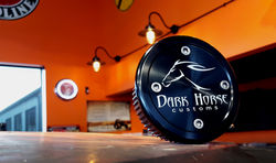 A custom drive flangeMachined with the Dark Horse Customs Logo | 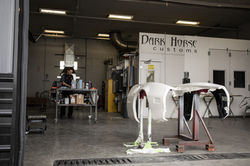 Decals I installed on the paint booth |
|---|---|
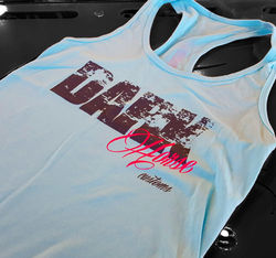 A fresh design for ladies branded apparel |  A Jeep hood that I created paint stencils for |
 A labor sign featuring a GTO |
Dark Horse Outfitters
In early 2018, Dark Horse Outfitters was opened as a secondary location focusing primarily on aftermarket accessories and snow removal equipment. I was asked to re-create the Dark Horse Customs logo to change the descriptor to "outfitters," and to use a different color for the (slightly) separate brand. At that time, Adobe still had integrated Pantone Colorbooks, so I chose a very standard shade of red; 485-C. Why 485-C? I selected this color for several different reasons: - Red is harmonious to orange (the color used for branding in Dark Horse Customs). - Anticipating selling snowplows from brands that also use red in their branding, using the same color would create a memorable association. - I distinctively used 485-C because it was the most standard shade of red I could find being used most universally among vinyl colors and print colors. Not only an easy PMS code to reference, it was also the same shade used in the brand of plastisol ink that our screen printer used. In 2024, Dark Horse Outfitters acquired Dark Horse Customs, and moved into the larger building that I worked in. I continued managing the branding for Dark Horse Outfitters and enjoyed doing so.
 A business card design from 2019 | 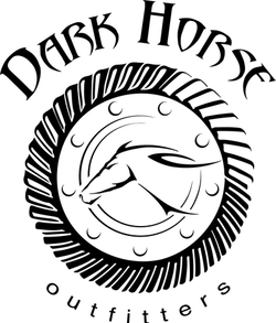 The beloved "Gearhead" alternate logo I drew in 2021 | 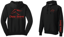 Men's branded sweatshirt |
|---|---|---|
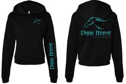 Ladies' branded sweatshirt |
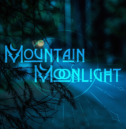
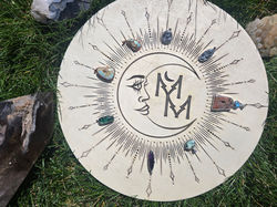
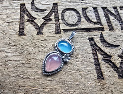
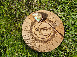
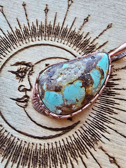
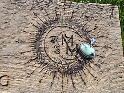
Mountain Moonlight Metalsmithing
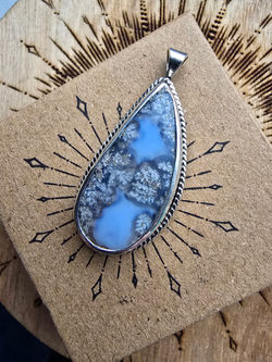
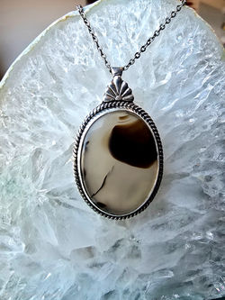
After a period of time fabricating jewelry and receiving requests to purchase my work, I decided to start my own small metalsmithing business as side-project. I knew that I wanted my brand to represent my Montana roots and embrace the styles I'm drawn to.
Taking into consideration that I did not want to imply any sort of exclusivity or lean into any cliché, I decided to use the word "Mountain" as opposed to "Montana." I also liked the idea of an alliteration for the sake of easy-to-remember abbreviations. With that in mind, I chose "metalsmithing" as the descriptor rather than "silversmithing," since I also fabricated copper jewelry.
RESEARCH
I searched the state's business registry to make sure "Mountain Moonlight Metalsmithing," wasn't already taken. "Mountain Moonlight" was used for another sole proprietor in a different field, but the entity had been inactive for a significant period of time. I was surprised that the name was still available and registered as a sole proprietor.